Thursday, March 31, 2016

Injury report + an awesome tutorial!

So I ended the Easter holidays with a nasty accident. We had been out shopping and I was in the process of putting the purchases away when I tripped, on what I cannot really tell, perhaps a shoe or my own feet - and crashed down two steps in the hallway. Somehow my foot got caught under me in a weird angle and I crash landed on top of it with my full weight and all the speed of the tumble. It was rather terrifying to lose control like that and fly through the air not knowing what the landing would be like, knowing only that this was bad. It felt like a rather long moment. 
When I landed I let out a primal scream that still today leaves my throat sore. My poor fiancé came running to see what happened and found me on the floor, shrieking. At first he thought I had injured my head as I was laying with my head directly next to the main water valve and he was afraid I had crashed my head into that big lump of metal with sharp things protruding from it. So I must consider myself very lucky that that didn't happen! 
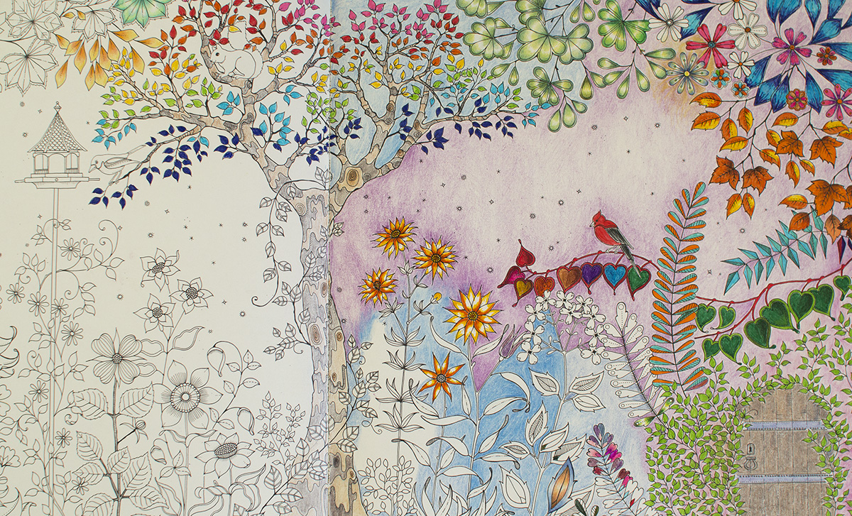
Just some pretty to brighten this boring post
We rushed to the hospital where we spent a total of 5 hours, 10 minutes of which was actually healthcare, the rest waiting for the nurse, the doctor, the X-ray, the doctor again... Fortunately nothing is broken, it's "just" a nasty sprain of the foot between the toes and the heel. It is now roughly the size and colour of a largish eggplant. I was fitted with an elastic bandage and a pair of crutches and we could finally go home. (The doctor must not be into colouring because he didn't write me any sick days.)
This week I'm working from home which gives me a little bit more free time as I don't have to travel to and from the office. This is nice but that extra time is pretty much consumed by the fact that a bathroom visit takes 15 minutes - travel time only - and preparing a cup of coffee almost 20. My fiancé had the genius idea to move my rolling desk chair to the kitchen where I can sit and work in incredible comfort with my foot up on a kitchen chair. Also I can use the chair to move around the house, because honestly the crutches are a big health and accident hazard. Twice I have hurt my injured foot when I lost my balance on those demonic contraptions. 
Before he rushed me to the hospital I managed to instruct my fiancé to pack some colouring supplies into my purse. Just the same day I scored an adorable little pocket sized book called "En liten målarbok för vuxna" in my local bookstore. I took the 36 set WHSmith pencils, a blender pencil and a stump along with a sharpener. This is really the perfect travel kit! So I wasn't bored while all the waiting at the hospital. 
These days I'm not sitting at my desk so I'm not getting a lot of advanced colouring done. I just colour in my little new book with the WHSmiths and some fineliners. The ironic thing is I was just getting ready to start on Bennett Klein's awesome book Colour My Sketchbook when the accident happened. May have to postpone that a bit but better late than never! Until then check out the amazing tutorial for one of the pages in the book. Trust me, you need this tutorial in your life! I tried the outliner trick on another drawing and it really works wonders!

Sunday, March 27, 2016

Drop EVEYTHING! Inktense pencils!!!

So I've had my 24 set Inktense pencils in my possession for a while. A while being a couple of years  - I got them for some freehand drawing, not having any idea what they were or what they did. Even after I started colouring I never really used them, preferring coloured pencils and Pitt markers over water-activated media. Then I saw this awesome video where the artist (who incidentally looks TEWTALLY like deNiro and has a very entertaining style to boot), tried actual watercolours in adult colouring books, among others a book I like very much, Color Me Calm.


This book did better than exptected at taking watercolours and so I decided to try out wet media in it! Also the Mind of Watercolor teaches an important lesson: you don't need to have the fanciest stuff to make great art. He paints a wonderful image on the crappiest paper using talent, hard work and patience. Something to remember for a shopaholic such as myself!
Inktense came in handy for trying wet media in my colouring books and so I started looking for inspiration which led me to Peta Hewitt. The Queen of Inktense. The High Priestess of Inktense. I cannot even begin to explain how wicked this woman is with this medium! Just look at her speed colouring of Coverack from the Magical City book.  Super awe inspiring!


As fun as the above speed colouring is to watch, the Holy Grail of Inktense tutorials is the video below where Peta explains all about the Inktense pencils: what sets them apart from watercolour pencils (quite a lot so you want this info before starting out with them!), how to manage the fact that they are permanent as soon as you wet them, how you therefore must blend your colours before wetting the paper and so on. This video is time well spent if you want yo get started with your Inktense pencils!


Last night I started experimenting with my Inktense for real. A point made by Peta Hewitt is that painting with Inktense is much quicker than colouring with dry coloured pencils. Another great pro for me as I often get frustrated with the pace I keep going through my colouring books. I half completed this landscape which can be considered my first try with Inktense.


I'm particularly happy with how the large trees in the middle turned out. My 24 set of Inktense has a really crappy selection of greens (of course I think ALL my pencil sets have crappy selections of greens! I'm just super fussy with my greens.) so I used some different colours to shade and create the illusion of some naturally occurring greenish-y colour. Then I realized the curly bits in the bottom left were... ferns. GREEN ferns. So the ferns are really crappily coloured as I was sick of the poor green selection in my 24 set and was equally tired of trying to blend a nice fern colour.

Then I did the next page with the cloud swirls, done in 4 colours. Here I used the technique where I touch my waterbrush to the pencil and then paint in one continuous stroke so that I get a beautiful smooth gradient from dark to light as the pigment dissipates from the bristles.


And last but not least this nature pattern mandala, also with just 4 colours. The photo shows the pattern before and after adding water.


The Waterbrush
I use the Pentel waterbrushes or rather the medium size so far, and for the most part I'm really pleased with it.. There are occasions when water starts flowing from the bristles but that is quickly fixed by dabbing the brush on a bit of kitchen towel. The water in the reservoir lasts forever and the bristles stay clean at all times, I don't have to wash and wash them to get them clean. Much prefer the waterbrush to a regular watercolour brush!


Paper Buckling
As you can see even the fairly thick paper in Color me Calm gets all buckly. But it still holds up for all the water I put on it and as Peta Hewitt says, the buckling adds character to the page :)
I think the images speak for themselves so if you don't already own a set of Inktense I highly recommend you place an order now! :)
(I think I should put a disclaimer here: all the art supplies and books you see on this blog are purchased - and photographed - by me. So it's all my own shopping and my own photos, I only write about stuff I have actually tried & I'm not endorsed by any manufacturer. So if I rave about something it's because I really love it, not because they sent a free sample) :)

Thursday, March 24, 2016

Lost Ocean: first completed page

Sticking to this palette in Lost Ocean... might digress from it as I saw a crab in Johanna Basford's feed all decked out in purples and oranges and rich pinks... but for now I like this cool, teal-dominated look!
I will add a background as well at a later point. But not just now lol!


Saturday, March 19, 2016

WIP from Lost Ocean

I have completed a few title pages and have one WIP in Lost Ocean. Using my WHSmith pencils and Staedtler fineliners.


A view from my window and a new desk thing

I spotted this desk organizing thingy at IKEA a few months ago and yesterday it had a "soon to be discontinued" sticker on it so I took one home with me. It's called Klimpen. My darling man assembled it in no time and now I have some neat little shelf space right on my desk. This led to me putting my WHSmith, Derwent Drawing and Inktense pencils back in their tins after they were previously stored in glasses as I now have a bit less penholdercup space. 
It snowed quite a bit today too! 


Wednesday, March 16, 2016

Marco Raffiné pencils - swatch and first impression

So it finally arrived, my box of the 72-count Marco Raffiné coloured pencils! I had seen the colouring community swoon and rave over these pencils for the past 6 months so I just had to see what all the fuss is about. I took the plunge when I saw the pencils being sold on Amazon for a similar price as Ebay. Earlier Amazon had some sellers but the price was so much higher than Ebay or Aliexpress that I couldn't justify getting them. Reports of ridiculously long delivery times from Ebay and Aliexpress deterred me from getting them from these sites, also I love Amazon's customer service whose generosity and solution focused approach has saved me on several occasions.

The first thing that struck me was the weight of the box. I don't know what I had thought but just seeing photos of the box never made me think it would weigh so much! It felt nice in my hand. However I discarded the box straight away, I hate flimsy cardboard boxes. Some people also complained about a strong chemical smell but I attributed this to the box. The pencils themselves smell good like wooden colouring pencils should. (I always sniff on everything new!)

The pencils never struck me as particularly handsome and real life confirmed this. The silvery finish is more plasticky than silvery and is unevenly applied on some pencils. The hexagonal shape and colour indicator on top are OK features. The wood is of varied quality: some pencils are flawless while others shave away quite a bit. However I was pleasantly surprised by the lead quality as I sharpened the whole 72 set and only got one minor tip breakage which was fixed with just a little bit more sharpening. All pencils arrived seemingly undamaged so I'm hoping that no leads are broken further inside the pencils!

The pencils have no colour names but fortunately they are numbered in a straightforward fashion, from 501 to 572, making swatching a breeze. I made a handdrawn colour chart as I currently don't possess an operating printer. Or, there is a printer but it's ink and I'm afraid to use it in colouring because the lines might smudge from blenders and such so we haven't really plugged it in.

Upon swatching I soon discovered that the individual pencils vary in quality within the set: some glide nicely along the paper giving off even and rich pigmentation, while others feel waxy and smeary and leave a patchy result. I therefore took a leaf out of Faber Castell's book and marked the individual pencils with dots from 1-3 depending on how smooth or smeary they feel. I fear the smeary ones will be very difficult to layer and blend, in addition to the feeling that you're pushing candle wax around the paper. (I know they're oil based but this is the best description to the feeling I can come up with.) Here's my quality scale and the number of pencils in each category:
3 dots (19 pencils): Superior quality, rich pigmentation, glides smoothly on the paper and leaves an even coat of colour
2 dots (38 pencils): Good quality, enough pigmentation, possible to layer and blend, no hesitation in using them. 
1 dot (15 pencils): Smeary and uneven result, and/or poor pigmentation. Use with caution in case it's a unique shade I don't have in other sets.

Palette wise I have mixed emotions. The purples and greens are great especially as I'm fussy with my greens and for example I'm not impressed with the greens in my 60 count Polychromos as I find there are to many cold greens in that set. The Raffinés contain many warm green shades that you're more likely to find in nature. The purples are also warm and rich and the yellows are surprisingly pigmented. However I find there could have been a couple more blues in stead of having so many greys. Six shades of grey are entirely too much in a set of 72. The browns and maroons are very nice, however to my disappointment, two of the dark neutrals I most looked forward to using turned out to be one-dotters. Otherwise the one-dotters seem to be mainly lighter pastelly colours which sort of makes sense, if the manufacturer achieved the pale shade by adding more binding material in stead of using a different pigment combination.

How these pencils perform on different kinds of paper and in different situations such as layering, burnishing and using with blending tools, remains to be seen. In any case I'm really looking forward to taking them for a test drive today!

Monday, March 14, 2016

My first ever colouring page!

I dove right into Secret garden the night I got it in the mail. I started with a 10-pack of Stadtler fineliners and some Inktense that I had at home. I dodn't give much thought to shading, color palette or anything fancy like that. Pretty soon I discovered Pinterest and the crazy amount of colouring inspo there, and I understood that I wanted some colouring skillz. I realized I wanted more than to just randomly colour inside the lines, and I quickly became unhappy with this first page. But in stead of scrapping it, I decided it would become my training/testing page. Handy in the start of the book, it now contains my first attempts at shading, swatches of new supplies, a go at the background thing and everything in between. I will continue using the spread for testing/training purposes and I'm sure it will be beautiful in the end, in a psychedelic sort of way.


Enchanted Forest, Swedish edition

A while back I purchased my second Johanna Basford book, Enchanted Forest. Most Swedish bookstores only carrry the Swedish edition but I never thought this would be a problem. 
The Swedish edition is published by Pagina, the same publishing house marketing Hanna Karlzons Dagdrömmar. Dagdrömmar has ecxellent paper quality and is overall a lovely book altogether, not only illustration wise but as a physical book as well. 
Enchanted Forest however, was a huge dissapointment. My Secret Garden is from the US but published in England and printed in China. It has to this day the best paper of any of my books. I can safely use any water-based media without so much as a shadow of bleeding, and it even holds some water on my Inktense pencils without getting all wobbly. So naturally I was expecting the same quality from the Swedish edition of Enchanted forest. The photos speak for themselves... you can clearly see the designs not only from the next page but from the next spread, so 2 pages apart. There is also near-bleeding jsut from Staedtler fineliners (and I'm a light handed colorist.)
I contacted Pagina about this and they said they'd look into the matter but I haven't heard from them since. I am keeping my Swedish Enchanted Forest as a training copy of if someone wants to borrow a book to try out colouring... and for myself I ordered the English version which again has excellent paper. A shame that quality varies so much locally! 

Bleeding :(

Visible design from 2 pages over

Welcome Spring!

March is a particularly difficult month for me. Having lived in Hungary for several years I got used to Spring arriving in early March, with the trees starting to turn green at the turn of March/April. In these parts of Sweden March is still very much a winter month, although the snow is mostly gone and you can start seeing some fresh green moss for example. Still the temperatures are barely above freezing and there will be several minus degree days yet. Therefore I tried to colour the moth of March as cheerful as I could, with all sorts of pastelly colours. 
Mad sketching skillz!
I also included a small freehand drawing project. Since March 15 marks the anniversary of the Hungarian revolution in 1848, which is one of three Hungarian national holidays, I added the symbol of this holiday to the calendar: a cockade in the Hungarian colours red, white and green. I had never drawn such an item before so I started with looking one up on the internet. There I traced the outlines onto a bit of tracing paper that I then transferred onto a sketch pad where I experimented a bit with colours and shading. I finally transferred the sketched outlines onto the calendar page and proceeded with colouring it in. Considering my drawing skills and particularly the fact that I haven't practiced drawing for many years (or let's be honest, I have precticed drawing NEVER), I'm really quite pleased with the end result! It looks so much nicer in real life too. 


The tree is coloured in Faber-Castell Pitt Artist brush pens, and the cockade in Polychromos.


Sunday, March 13, 2016

Crafty post: pencil holder cups from IKEA!

Since we're recently moved into our house, we spend a considerable time at IKEA. Like most people we remember we need something about once a week so we end up making IKEA runs pretty frequently. My colleagues ask me every Friday: so, did you go to IKEA last night? As Thursdays are our usual shopping nights :)


On one of these runs I discovered these glasses that turned out to be the ideal pencil holders! I love that they are simple and clear so I can see the whole pencil/pen. I love glass as a material, I think it looks so luxurious the way it reflects the light. If I could I would have glass panes on every bookshelf and kitchen cabinet in the house.(Actually thinking about it I DO have glass panes on all the bookshelves!) These glasses will comfortably hold any set of 24; larger sets than that I keep in their tins. Also my "fancy" coloured fineliners, the Staedtler Triplus, I keep horizontally. For everything else ther is Masterc... these glasses!
They are called 365+ and come in two sizes, a taller and a shorter size. Personally I prefer the shorter ones as they show more of the pencil and I like how the pencils sort of spread out in the short ones. But to each his own! The best part is that they are really inexpensive, 29kr for the small and 39 for the large, that is for a set of 6. A perfect bargain especially considering that art stores charge you big bucks for really ugly pencil holders.

I spent last night pimping a couple of them, I even made an Eastery one. I used decoupage paper, regular paper napkins, satin ribbons and a decoupage gloss. They turned out a bit not-so-perfect but for my craft desk they will do just fine!


Monday, March 7, 2016

Colouring Calendar and F-C Pitt artist pens

Just a quick page tonight before bedtime, from Jenean Morrison's 2016 colouring calendar. It's a tome! Nearly A4 size and thick as a phonebook. I'm mainly using my 48 set of Faber Castell Pitt artist pens, with the brush tip, for this book. I'm also working on a review of these pens as there is very little online in way of blog posts or youtube videos about them! I'll show you how you can use them for shading and what sets them apart from other markers. As I'm a bit fussy with the photography bit I'll have to wait until the weekend until I can shoot proper pics for the review and perhaps also a small video about shading and combining with other media. We'll see! For now, let's see if I can finish some more pages in this bible. I'm lagging behind to say the least, I have coloured just one more page since New Year's. I think I might have too many books! .. said no colourista ever :)
I'm also working on the March page of the Secret Garden wall calendar. The design itself is finished but I want to add a detail to commemorate the national holiday of Hungary that's coming up in a week.

Sunday, March 6, 2016

Colur along challenge!


In one of the lovely groups I belong to, the Daydreamers, there was a colour along event. If you own and love Dagdrömmar, you should definitely join this group! You can even join in on this current event as it will run for another couple weeks or so. :)
We could choose from two images and were given a limited, pastelly colour palette plus a couple of darker hues for shading only. It was quite a challenge because as much as I liked the palette itself, I had problems with both images. The jellyfish I wanted to save for a different colour palette, with more bright and aquatic shades. And the dragonfly isn't my favourite design in the book to say the least... I just wasn't feeling it for some reason. Also I have seen so many gorgeous dragonfly colourings, especially from Enchanted Forest, that I was certain I wasn't going to do it justice. 
The beginning of the project was a real struggle. I wasn't feeling the colours and it just didn't look right. To bring the colours together, in desperation I grabbed a chalky white pencil from the Derwent Drawing set and went over the whole dragonfly with it. It proved to be a vast improvement as the colours now looked much more coherent. Yay me! 
On the body of the dragonfly I wanted to keep the black outlines so after I was done with the white pencil I took a black pen (the Faber-Castell Pitt artist pen in size Small) and inked the outlines I wanted to keep back in. Here are photos of the white pencil and then the bits I inked in afterwards. 


In the bottom picture you can see how I coloured the wings as well. The whole wing was then covered with the white pencil but on the wings I didn't bother inking the outlines back in as I wanted a sortof see-through iridescent look for the wings. In the group some people did an amazing job creating real iridescent effect using colourless glitter pen over the wings, but as I don't possess such a tool I had to come up with a solution of my own. I think it turned out OK, especially for being a design I didn't much care for from the beginning.

The flowers proved to be another challenge. Making the "petaly" flowers pink and blue was sort of obvious but what to do with the round ones? At first I used a pale greyish green. To say the least this wasn't a success. The green colour looked so incredibly off next to the pink dragonfly and blue-pink flowers. In the end I ended up taking an eraser to the green and lifting off as much of it as I could without messing up the paper. Fortunately the paper in this book is really really good so I actually got away with erasing coloured pencils, haha. Also the pencil I had used came from the Derwent Drawing set which puts down a creamy coat of colour that doesn't scratch or burnish the paper so it's easier to lift off than an ordinary coloured pencil.

After most of the green was gone I used my shading colour, Dark Indigo, to add some definition to the edges of the flowers then went over them with the white pencil again. The double leaves and the little berry thingies were shaded using my light blue and the shading colour. At the end I went in with a silver pen and added some embellishment to the design (as seen below). It turned out really nice! I may or may not add a background at some point but for now I'm really pleased with the result. This project took me one evening and an hour the next morning plus the time it took to photograph. 


Wednesday, March 2, 2016

Blending stumps!

Pages from Dagdrömmar and Color me Calm where I prepared the background using Polychromos and paper stumps.

I get a lot of requests to explain about the paper stumps I so frequently use in my colouring projects. So here is a long overdue summary about this great tool! I personally find myself going more and more away from the colourless blender pencil, which I feel gives a more streaky and uneven finish, and using the paper stump more and more as I like the smooth smoky surface it gives. I have used it mainly for backgrounds in the past but nowadays I blend everything but the finest details with the paper stumps.
First of all, this is what they look like - a roll of cardboard with two pointy ends. You can find them in any art supply store and they are very inexpensive. I learned that there is a similar tool called a tortillon, which is hollow. These stumps are solid all the way through. I have never come across hollow tortillons in Sweden but you might want to know the difference if they are a thing in your country.

Like I shortly mentioned in my previous video, paper stumps are ideal for larger surfaces. But as they come in a variety of sizes, you can use them in quite detailed areas as well. 
Depending on how much pigment you have laid down with your pencil, you can use a very light hand, barely grazing the paper, or a more heavy touch, when blening. If you have several layers of colour on the paper it's enough to just lightly go over the paper with the stump to get a nice smoky blend. The stumps will conceal some of the streakiness in your colouring, but the blending will be much nicer if you try to lay down the colour as evenly as possible. You can clearly see the difference in this closeup where the orange bits were quite haphazardly coloured whereas the surrounding blue parts were coloured much more carefully before blending.
You can also use your blending stumps together with blending agents such as Gamsol or vaseline. However I only use mine dry so I cannot say anything about those methods. If I ever get around to trying that I'll make an update post about it!

As you can see in the first photo I keep a stump roughly per colour family. However these guys require cleaning from time to time. This is done with a piece of fine-grained sandpaper which I picked up at a hardware store. I cut the sheet in smaller sized squares so they would fit into a drawer compartment in my desk. 

Cleaning them like this will ensure they don't mess up your colour scheme and keep their point. If the point becomes too used up and frayed I just use a pair of scissors to cut it off then sharpen it again on the sandpaper. As the stumps are made of solid cardboard they will last a very long time. However if you find yourself with a pencil cup full of "dirty" paper stumps, you can create a craft project of its own and not let that precious pigment go to waste. One evening when I had no colouring inspiration I started scribbling on a blank sheet of sketching paper with a dirty stump. And before I knew it I had created this pastelly background that I can later fill with a drawing of some kind.


Below you will find a comparison closeup of two similar fields, the top one with no blending, just the layering of 2 Polychromos pencils, and the bottom one blended with a paper stump. And finally I enclose a short video that shows the layering and blending process. I hope this was helpful - Happy colouring!