When I started this blog I made a kind of statement out of having purchased every item I post myself. I really don't mind reading sponsored blogs but sometimes I feel a bit overwhelmed by marketing that seems to be seeping into every corner of life nowadays, and I really want my little social media outlets to be a kind of sanctuary away from all that. Also I'm apalled by the widespread practice used by mainly Chinese vendors on Amazon who seem to blanket people with goods "in exchange for an honest review" and somehow I rarely find those reviews either particularly honest or very helpful. Marco Raffinés, I'm looking at you!
 The other day though I saw post from an indie illustrator I follow on Instagram, Päivi Vesala. She wondered if there were any people interested in reviewing her first colouring book as she's hard at work on the second. I really like her work so I volunteered to receive a copy from the publisher. So strictly speaking my blog is no longer sponsor-free, but I don't feel bad about spreading the word about an independent artist - whose Facebook page currently stands at 540 likes - and hopefully this can't be considered to compromise my integrity. I would see no point in reviewing stuff that appears widely commercially, just for the chance of a free copy (although if Faber-Castell ever wants to throw a set of Albrecht Dürers my way I probably get off my high horse faster than you can say sellout). For future reference, all items presented will be purchased by me just like before - unless stated otherwise. Regardless of the source, my reviews will continue to focus on books and art supplies that are a bit unusual and that I don't see all over the place.
Hopefully this long introduction has left at least some people awake to look at the actual book!
Mielikuvia vol 1 comes with an attractive reddish cover and is spiral-bound, something that will please a lot of people out there. The book has 100 pages which means 50 illustrations as the pages are one-sided. Anthing else would have been madness because the paper is the one big drawback of this publication. I'm not very picky about paper quality - just about any paper will handle Polychromos well enough. But I do wish that more publishers and artists would pay more attention to paper quality, it would be a real treat if all the beautiful illustrations were brought to us on nice paper. There is not one colouring tool that doesn't perform much nicer on good paper!
The paper in Mielikuvia vol 1 is not very different from printer paper. It's OK with Polychromos and Triplus fineliners and even handles Pitt artist pens without pilling the paper, which is impressive considering the thinness of the paper and the fact that the Pitt pens are rather wet and therefore can a bit difficult on low quality paper. All in all I'm OK with the paper but I hope for sure for an upgrade for the next volume!
The illustrations are lovely and right up my alley with a mix of quirky, imaginative and expressive images ranging from very detailed to very bold. Some pages are drawn with thin spidery outlines while in other images, the black ink almost dominates the design. On the Facebook page there are plenty of inspiration colourings, I especially liked this one with the little fleet of bizarre flying fish soaring very purposefully in the rain. :) Apparently Päivi is an expert colourist in addition to skilled illustrator! Definitely stealing this colour scheme for the future.

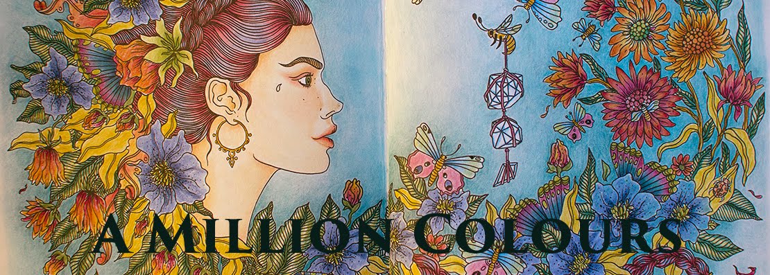
The above picture is from the Facebook photo gallery of the coloured pages in the book.
Here are some photos I took from my own copy:


All in all I'm going to have great fun colouring this book and am really looking forward to colume 2, here's a sneak peak from Facebook:


