Sunday, February 28, 2016

Art Therapy Scandinavia

The Art Therapy line of colouring books has popped up in many countries. You know the A4-sized rather thick books with a cardboard front cover that has the front page image glued to it. There are dozens of books in the series: Art Deco, Islamic tiles, Indian patterns and so on. While on vacation in Rome, I saw a book in this series with Scandinavian patterns. Interestingly, this book is yet to be published in Sweden so naturally I picked it up. It has since become one of my favourite colouring books!


Art Therapy Scandinavia is a hybrid of named artists work and Shutterstock images. (Please follow this link for an explanation/review of Shutterstock books.) Above is the cover which is a sturdy brown paper glued to the usual thick cardboard cover which is typical for this series. I actually like this binding, it's an inexpensive way to make strudy colouring books which you can colour on your lap when space is tight.
Inside one of the first pages is this lovely stylized landscape with the cottage which I have coloured in using Polychromos pencils.
Like most Shutterstock books, the paper is not perfect but still sturdy enough to hold water-based markers and fineliners without any bleeding. The pages are double-sided and not perforated, but the book opens up nicely so there is no struggle reaching the innermost parts of the page.The designs are also not printed all over the page, there usually is a clear margin of a few centimeters which also makes it easier to reach the edges.

Many of the pages contain folk-art patterns common in different Swedish and other Scandinavian regions. In the Dalarna region these patterns are called "kurbits". These are great fun to colour although most of them are not very detailed. But of course every pattern is what you make of it, you can put as little or as much effort into something as you feel like at the moment. These patterns are quite quick to colour with the Faber-Castell Pitt Artist pens with the brush nib being the perfect size for this amount of detail. 

Two "Kurbits" patterns coloured with F-C Pitt Artist pens
There are also other patterns in the book which is wonderfully varied. Some are folk inspired, others are a representation of typical Scandinavian landscapes, towns or traditions such as coffee-drinking :) Here are some more examples.

The left one is also done in the Pitt artist pens, while the right image is a WIP with Polychromos.

Overall, this book is one I reach for whenever I want a bit of a fancyful and diverse relaxation. It contains everything from decorative folklore patterns, whimsical coffeecups, a few stylized urban and interior scenes and many other lovely designs. The book is also very well edited so that all the images maintain approximately the same style of art, even though they come from several different artists. So if this book is available in your country, I definitely recommend you go and pick it up. And Swedish publisher Tukan förlag, I'm looking at you - bring this book to Sweden pronto!

[UPDATE] My colouring friend on Instagram, @girl_with_javacurls, asked to see some pictures from the book so here they are, in extremely poor photo quality :


WHSmith colouring pencils - a review

A few days ago I started swatching my 36 count WHSMith colouring pencils. I was pleasantly surprised! Here's a review of these pencils.
- The pencils come in a glossy cardboard box with a plastic holder. I can see myself discarding this in the future as I tend to keep smaller sets of pens/pencils in clear containers. The design is lovely, with a dark grey pencil and colour indicators on the top. The hexagonal pencils are comfortable to hold and have a matt finish.
- The colour selection is really nice. You get all your usual primaries and secondaries that you usually see in a set of this size, and there are also some lovely and unique shades with a surprisingly good neutral palette. For example the dark teal one (last one in the third row) is one I see myself using a lot. The magenta and the brick colour are my other favourites in the set. The only shades I'm not crazy about are the two brightest yellows. They are not really pigmented and the next two yellow shades would be fully enough. But I've never been a fan of light, cool yellows, I'm more of a saffron yellow kind of person.
- The pigmentation is a pleasant surprise. These pencils are more affordable than the Staedtler Noris Club ones (at least in our currency that is the case) but lay down such a nicer pigment. You can get a vibrant colour almost instantly with very little pressure. The pencils are layerable and blend very well with each other. Compared to the Polychromos they lay down a bit more streaky colour and feel a bit more scratchy against the paper, but this can be corrected using a bit of layering. 
- The pencils came in the mail and although they were very well wrapped, it's not unusual for the leads to be damaged during transport. I haven't notice any broken leads and the pencils sharpen easily to a very fine point which they keep for a reasonable amount of time. As they are rather soft, I expect they will spend a fair amount of time in the sharpener, but this is the price for soft, pigmented pencils that lay down a creamy colour.
- I tried blending using two tools: a paper stump and a blender pencil. The paper stump easily gave the best result with these pencils. The gradient came out smoky and perfect, whereas the blender pencil mostly made a streaky, blotchy mess of the swatch. I can see myself using the blender pencil on very small areas but for anything of even the size of these swatches, a fine paper stump would be the more ideal blending tool of the two.


Conclusion: If you can get your hands on these pencils, go for it! If you already have a selection of pencils these will be great for a smaller set to take with you on the road or to add some new shades to your palette. If you're new to colouring, you may use these for a long time before feeling the need to graduate to a larger set or more prestigious brand. 

PS. When I started Lost Ocean a few days ago, I was going to use the 24-count Noris Club pencils for the whole book. But shortly after finishing the title page my hands started aching from the pressure I had to use and I was frustrated by the weak pigmentation. So I'm switching to this set of WHSmith pencils for the whole of Lost Ocean. Wish me luck!

Shutterstock books vs artist books!

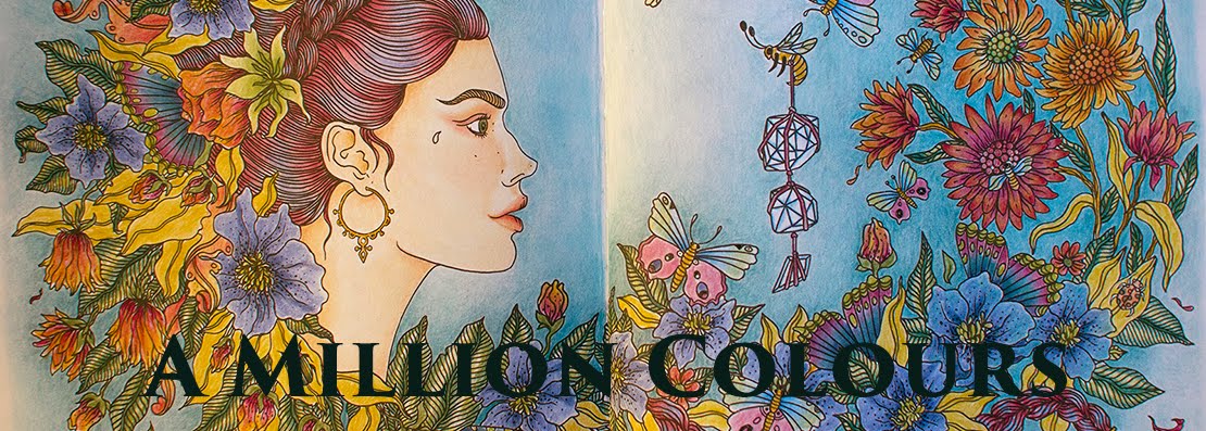
When I first started purchasing colouring books I soon discovered that some publications were made up of compliations of Shutterstock images rather than displaying just one artist. In this post I am going to do a review of Shutterstock books, tell you about what to look for and avoid and also some of the pros and cons of this type of publications.

Shutterstock is a huge online stock image bank where anyone can upload their images (drawings or photographs) for sale. Shutterstock takes a large piece of the revenue and the rest is transferred to the artist. The upside is of course that you get a platform to sell your images where buyers can search based on theme or keywords. This gives a potential to be found on a gigantic market and there is a chance for huge sales. Many photographers make a living off stock sites; they take pictures that have the potential to sell to different publications. You know those illustrations in brochures of piles of coins or people shaking hands or someone smiling into a headset? Typical stock photography. 

Earnings breakdown of Shutterstock.
Anyhow, Shutterstock is also home to many colouring pages and some of the largest publishing houses have jumped on the bandwagon and are churning out dozens and hundreds of books based on Shutterstock compilations. This is a quite different form of publishing compared to "single artist" books where the publisher works directly with an artist to make a book containing images from that particular illustrator. Johanna Basford is perhaps the best known such artist but there are a bunch out there such as Hanna Karlzon or another favourite of mine, Jenean Morrison.
You typically recognize Shutterstock books from the fact that they lack the name of any one artist on the cover. They could be a part of a series such as the Art Therapy books (although there are named artists featured in series of books too). Most of the time the image sources are displayed as Shutterstock and sometimes the name of the Shutterstock artists are displayed as well.

The Cons

One of the main problems with Shutterstock books is that you may encounter dupes or duplicates of images you already have in another such book. Occasionally the same image can appear multiple times within the same book! One of the stock books I have has double spreads where one image is full size and the other is a slightly enlarged version. I find this a lazy editing at best and bordering on a ripoff at worst. I mean, just look at these two pages:


The first page the left side is simple an inverted version of the right one. And the second page is just an enlarged and a zoomed out version of the exact same image. Like I said, this is really sloppy in my opinion and a cheap way to fill a bunch of pages that you then sell for 8 euros. Compared to how much more work must have gone into Johanna Basford's books that sell for 10-12 euros, I find these books very expensive in comparison.

Another con with these books is the paper quality. Very rarely is the paper good enough to hold even water-based markers or fineliners. The same fineliners that work perfectly in Secret Garden bleed through in many stock books. 

My third problem with these books is I don't know how much the artist gets paid for usage of their images. Probably not that much. I imagine if a publisher strikes a deal with an artist, the artist gets a chance to negotiate the contract so that everyone gets a fair share of the profits. Stock images are often purchased royalty-free, that is the buyer pays a fixed price for the image regardless how many times that image is then sold on. 

The Pros

Shutterstock books aren't all that bad though, and for all the con points there is a pro counterpart:

- Dupes can be a great way to practice and make different versions of an image without the need to make copies. If you like your books the way they are and don't care much for loose colouring pages, this is actually a great pro.
- Stock books give you a chance to explore the work of perhaps dozens of artists within the same book. This gives great variety and ensures you never tire of the patterns, and also gives you a chance to try new styles of pages. You may not love every page but most pages turn out beautiful when coloured, even if at first you're not thrilled with the lineart.
- The paper is not a problem with colouring pencils which is perhaps the most used medium anyways. Every limitation is also a challenge at the same time.
- The artists who upload to Shutterstock are in no way forced to sign the terms and agreements. I sell my photos through Getty Images who sells them for up to 700 euros a piece of which I receive perhaps 10%. But without Getty the photo would never have been sold at all because I hate selling stuff. So it's a great way to have someone else take care of everything for me and all I do is upload images I took just as a hobby (so no extra work) and receive some money to my paypal from time to time. 
- Ultimately, both stock books and single artist books contribute to the vast selection of books out there, so that everyone can find their favourites - For example, in this book I really love the square size and that each page is neatly framed in a small pattern. I love, love, love framed pages! 
Having stock books as well as single artist books on the market also enables more people than just the most noted artists to benefit from this huge new market of adult colouring. 

Here is a page from the above book. The book itself is one I picked up while vacationing in Rome. It's called I Libri Antistress Fiori from publisher EdiCart.

In the next post I will present and review my personal favourite from Shutterstock books which is also one of my absolute favourite colouring books!

Saturday, February 27, 2016

The best time!

When your house is clean, the laundry done, dinner is slowly cooking on the stove behind you, the sun is shining on your tulips... and your fiancé has taken the kid to a birthday party so you have a few quiet hours to spend as you like :)


Wednesday, February 24, 2016

Swatching in progress!

Swatching my WHSmith pencils. So far they're lovely! Will post a review once I'm finished. I'm making rather large squares because half of them I'll blend with blender pencil to display that effect as well. The white paper is laid over the finished squares to avoid smudging from my hand (I'm a leftie).

Monday, February 22, 2016

A wonderful encounter!

I have mentioned how much I like belonging to my colouring communities on Facebook. Interestingly, it's the smaller of the two groups that I prefer, it has such a nice atmosphere (so does the other one but that one's a bit too large and therefore perhaps a bit less personal).
Anyway, since haul/supply posts are fortunately allowed in these groups ;), I've had the opportunity to see a lot of people praising the WHSmith colouring pencils. To be honest, I first fell for their very handsome design. They are just so pretty on the outside! And the quote, The spectrum sings, it's just so sublime. I know I'm being silly! :) but anyhow, the other day I posted in my fave group a small complaint about how I'd love to try these pencils but WHSmith doesn't deliver to Sweden. And lo and behold, a great number of members volunteered to mail me a set!! In the end we agreed with a fellow member to swap items: I would send her the postcard book Vinterdrömmar by Hanna Karlzon (the Dagdrömmar lady!) and she would send me the pencils. 
It was of course a small leap of faith, giving out your address to a virtual stranger and everything... but it felt right! Needless to say Samantha, as her name is, got my parcel first, shame on you again and again Postnord... but today the beautiful pencils arrived! As an added bonus the parcel even fit into our mailbox so we didn't have to drive all the way to the grocery store (since we no longer have any post offices in Sweden anymore)
Upon opening the parcel there was another surprise. I thought I'd get the24 set, instead there was a 36 set of pencils in the package! I yelled out so my fiancé came running in from the car. He thought we'd been burgled as I stood in the doorway, shoes and coat still on, screaming. Lol! Then he realized it was pencils... then he was no longer surprised!


This wonderful gift came with very good timing. I've been pining after the 72 set Inktense pencils. I have the 24 set but would really love to upgrade and they are crazy expensive. Recently we talked about treating ourselves to something nice as we moved into our new house just five weeks ago and we have hardly rested, spent each waking our after work unpacking and fixing around the house. The fiancé, or S. as we can call him, was going to buy a nice pair of gaming headphones and I was going to get the Inktense. But after some calculations we agreeed to not spend anything on luxury items as there are so many expenses around the house these coming months. We agreed on this this morning so to get these gorgeous pencils, together with a new friendship, was really great for me today. Thank you, Samantha :)


A double page from Secret Garden

I spent several weeks on these pages. They are blended with the Caran d'Ache colourless blender pencils that I demonstrated in the video in the previous post. (If you clock on the picture a larger version will appear.)


Some blending tools

A flower design where the petals on the right are blended with a colourless blender pencil.

Blending is a great way to add some oomph to your coloured pencils. It can make the colours more vibrant, smooth out some of the streaks and lines and even protect your design from smudging. This Christmas I got my sister some blender pencils. As she was clueless as to how to use them - and she lives across the Atlantic -, I made her this video about my blender pencils of choice and a comparison with paper stumps, another useful tool. Perhaps the video will be useful to some of you who have been wondering about blending!


A place to belong

Since I took up colouring I have learned about the therapeutic benefits of this lovely hobby. I myself don't have any "issues", at least not any diagnosed ones although there is something I probably should see someone about - but just to handle the day to day stress, colouring is amazing. But equally amazing is the colouring community! I have seen many forums, facebook grups et cetera but nowhere do I experience such an encouraging and loving atmosphere as in the two colouring groups that I recently joined. People are really supportive and caring towards each other and for a shy introvert such as myself to be so welcomed and reassured, it really lifts my spirit several times a day and restores faith in humanity. 

Shortly after I took up colouring I joined a Swedish group. There I had quite different experiences. (I don't think it has to do with ethnicity or nationality, it's more the culture that develops in a certain group, much depending on the direction the admins steer it to) There was hardly a week or even day without some sort of drama. Often it would be someone who got upset about other people's purchases and questioned why hauls of books/supplies were even posted in the group, claiming it was offensive to all those who at that time couldn't afford to purchase those items. But people could also be offended if someone was thought to be too "skilled" or artistic. Often there would be drama around a person complaining that their work wasn't good enough for the group and the "talented" members got too many likes. In the end the admins made the decision to ban the posting of purchases/items in again. I left the group before a ban on too pretty colouring was introduced ;) no but seriously, it just seemed that way too many people found a way to turn this relaxing and therapeutic hobby into just another source of frustration and anxiety. That felt completely wrong! 
I find both hauls and majestic images very inspiring even if I cannot afford everything and definitely am not as talented as some people out there. But the thing I love most about belonging to these Facebook communities is to see people get so much joy and relaxation from their hobby!

Major haul of books and pencils!

How it all began...

I guess the story of how I came to love adult colouring is one of learning humility and open-mindedness. I had seen adult colouring books, notably Secret Garden, popping up around Swedish bookstores in the summer of 2015. I remember being utterly provoked by such a stupid idea. I couldn't for the life of me understand the point of taking someone else's artwork and adding colours to it. I viewed this as almost immoral or at the very least a completely meaningless pastime. 
Then in August my sister, who had no idea of my sentiments towards adult  colouring, sent me my birthday gift. It contained a copy of Secret Garden and an assortment of coloured fineliners. I nearly fell out of my chair laughing and was convinced that she really missed the mark this time. However I did want to give it a go just to see what all the fuss was about. Like I said, this was in mid August of last year and I have hardly stood up from my colouring ever since.

I was, to put it mildly, hooked from the start. It was instantly relaxing, gratifying and just pure fun. I soon dug out long forgotten art supplies I had from another life when I tried to draw and sketch with very little luck. Then I discovered the mind-boggling selection of adult colouring books on Amazon and other bookstores and, well, the rest is history. I have never been so glad to be proven wrong in my life!

My very first attempt at adult colouring. Secret Garden and Staedtler Triplus 0.4 roller pens