Thursday, March 24, 2016

Lost Ocean: first completed page

Sticking to this palette in Lost Ocean... might digress from it as I saw a crab in Johanna Basford's feed all decked out in purples and oranges and rich pinks... but for now I like this cool, teal-dominated look!
I will add a background as well at a later point. But not just now lol!


Saturday, March 19, 2016

WIP from Lost Ocean

I have completed a few title pages and have one WIP in Lost Ocean. Using my WHSmith pencils and Staedtler fineliners.


A view from my window and a new desk thing

I spotted this desk organizing thingy at IKEA a few months ago and yesterday it had a "soon to be discontinued" sticker on it so I took one home with me. It's called Klimpen. My darling man assembled it in no time and now I have some neat little shelf space right on my desk. This led to me putting my WHSmith, Derwent Drawing and Inktense pencils back in their tins after they were previously stored in glasses as I now have a bit less penholdercup space. 
It snowed quite a bit today too! 


Wednesday, March 16, 2016

Marco Raffiné pencils - swatch and first impression

So it finally arrived, my box of the 72-count Marco Raffiné coloured pencils! I had seen the colouring community swoon and rave over these pencils for the past 6 months so I just had to see what all the fuss is about. I took the plunge when I saw the pencils being sold on Amazon for a similar price as Ebay. Earlier Amazon had some sellers but the price was so much higher than Ebay or Aliexpress that I couldn't justify getting them. Reports of ridiculously long delivery times from Ebay and Aliexpress deterred me from getting them from these sites, also I love Amazon's customer service whose generosity and solution focused approach has saved me on several occasions.

The first thing that struck me was the weight of the box. I don't know what I had thought but just seeing photos of the box never made me think it would weigh so much! It felt nice in my hand. However I discarded the box straight away, I hate flimsy cardboard boxes. Some people also complained about a strong chemical smell but I attributed this to the box. The pencils themselves smell good like wooden colouring pencils should. (I always sniff on everything new!)

The pencils never struck me as particularly handsome and real life confirmed this. The silvery finish is more plasticky than silvery and is unevenly applied on some pencils. The hexagonal shape and colour indicator on top are OK features. The wood is of varied quality: some pencils are flawless while others shave away quite a bit. However I was pleasantly surprised by the lead quality as I sharpened the whole 72 set and only got one minor tip breakage which was fixed with just a little bit more sharpening. All pencils arrived seemingly undamaged so I'm hoping that no leads are broken further inside the pencils!

The pencils have no colour names but fortunately they are numbered in a straightforward fashion, from 501 to 572, making swatching a breeze. I made a handdrawn colour chart as I currently don't possess an operating printer. Or, there is a printer but it's ink and I'm afraid to use it in colouring because the lines might smudge from blenders and such so we haven't really plugged it in.

Upon swatching I soon discovered that the individual pencils vary in quality within the set: some glide nicely along the paper giving off even and rich pigmentation, while others feel waxy and smeary and leave a patchy result. I therefore took a leaf out of Faber Castell's book and marked the individual pencils with dots from 1-3 depending on how smooth or smeary they feel. I fear the smeary ones will be very difficult to layer and blend, in addition to the feeling that you're pushing candle wax around the paper. (I know they're oil based but this is the best description to the feeling I can come up with.) Here's my quality scale and the number of pencils in each category:
3 dots (19 pencils): Superior quality, rich pigmentation, glides smoothly on the paper and leaves an even coat of colour
2 dots (38 pencils): Good quality, enough pigmentation, possible to layer and blend, no hesitation in using them. 
1 dot (15 pencils): Smeary and uneven result, and/or poor pigmentation. Use with caution in case it's a unique shade I don't have in other sets.

Palette wise I have mixed emotions. The purples and greens are great especially as I'm fussy with my greens and for example I'm not impressed with the greens in my 60 count Polychromos as I find there are to many cold greens in that set. The Raffinés contain many warm green shades that you're more likely to find in nature. The purples are also warm and rich and the yellows are surprisingly pigmented. However I find there could have been a couple more blues in stead of having so many greys. Six shades of grey are entirely too much in a set of 72. The browns and maroons are very nice, however to my disappointment, two of the dark neutrals I most looked forward to using turned out to be one-dotters. Otherwise the one-dotters seem to be mainly lighter pastelly colours which sort of makes sense, if the manufacturer achieved the pale shade by adding more binding material in stead of using a different pigment combination.

How these pencils perform on different kinds of paper and in different situations such as layering, burnishing and using with blending tools, remains to be seen. In any case I'm really looking forward to taking them for a test drive today!

Monday, March 14, 2016

My first ever colouring page!

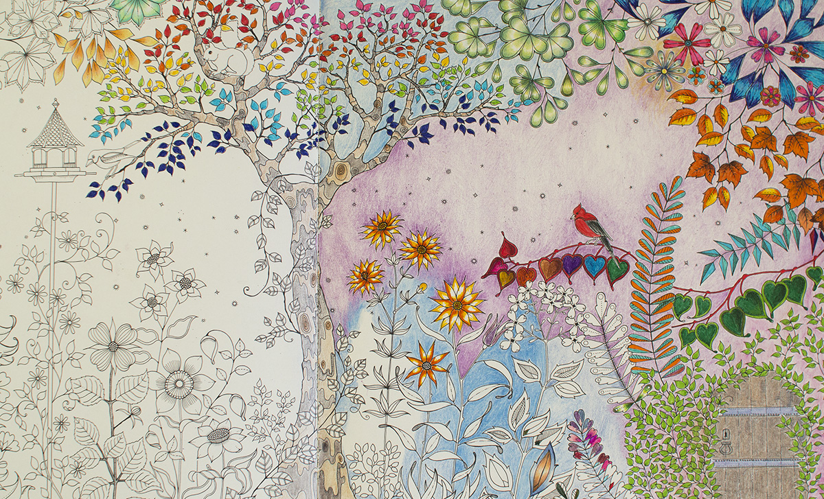
I dove right into Secret garden the night I got it in the mail. I started with a 10-pack of Stadtler fineliners and some Inktense that I had at home. I dodn't give much thought to shading, color palette or anything fancy like that. Pretty soon I discovered Pinterest and the crazy amount of colouring inspo there, and I understood that I wanted some colouring skillz. I realized I wanted more than to just randomly colour inside the lines, and I quickly became unhappy with this first page. But in stead of scrapping it, I decided it would become my training/testing page. Handy in the start of the book, it now contains my first attempts at shading, swatches of new supplies, a go at the background thing and everything in between. I will continue using the spread for testing/training purposes and I'm sure it will be beautiful in the end, in a psychedelic sort of way.


Enchanted Forest, Swedish edition

A while back I purchased my second Johanna Basford book, Enchanted Forest. Most Swedish bookstores only carrry the Swedish edition but I never thought this would be a problem. 
The Swedish edition is published by Pagina, the same publishing house marketing Hanna Karlzons Dagdrömmar. Dagdrömmar has ecxellent paper quality and is overall a lovely book altogether, not only illustration wise but as a physical book as well. 
Enchanted Forest however, was a huge dissapointment. My Secret Garden is from the US but published in England and printed in China. It has to this day the best paper of any of my books. I can safely use any water-based media without so much as a shadow of bleeding, and it even holds some water on my Inktense pencils without getting all wobbly. So naturally I was expecting the same quality from the Swedish edition of Enchanted forest. The photos speak for themselves... you can clearly see the designs not only from the next page but from the next spread, so 2 pages apart. There is also near-bleeding jsut from Staedtler fineliners (and I'm a light handed colorist.)
I contacted Pagina about this and they said they'd look into the matter but I haven't heard from them since. I am keeping my Swedish Enchanted Forest as a training copy of if someone wants to borrow a book to try out colouring... and for myself I ordered the English version which again has excellent paper. A shame that quality varies so much locally! 

Bleeding :(

Visible design from 2 pages over

Welcome Spring!

March is a particularly difficult month for me. Having lived in Hungary for several years I got used to Spring arriving in early March, with the trees starting to turn green at the turn of March/April. In these parts of Sweden March is still very much a winter month, although the snow is mostly gone and you can start seeing some fresh green moss for example. Still the temperatures are barely above freezing and there will be several minus degree days yet. Therefore I tried to colour the moth of March as cheerful as I could, with all sorts of pastelly colours. 
Mad sketching skillz!
I also included a small freehand drawing project. Since March 15 marks the anniversary of the Hungarian revolution in 1848, which is one of three Hungarian national holidays, I added the symbol of this holiday to the calendar: a cockade in the Hungarian colours red, white and green. I had never drawn such an item before so I started with looking one up on the internet. There I traced the outlines onto a bit of tracing paper that I then transferred onto a sketch pad where I experimented a bit with colours and shading. I finally transferred the sketched outlines onto the calendar page and proceeded with colouring it in. Considering my drawing skills and particularly the fact that I haven't practiced drawing for many years (or let's be honest, I have precticed drawing NEVER), I'm really quite pleased with the end result! It looks so much nicer in real life too. 


The tree is coloured in Faber-Castell Pitt Artist brush pens, and the cockade in Polychromos.